| | Along Came a Spider : 12/12/15 Undertale Comic |    |
|
|
| Author | Message |
|---|
Spidey
Spectral

Posts : 952
Join date : 2013-03-31
 |  Subject: Re: Along Came a Spider : 12/12/15 Undertale Comic Subject: Re: Along Came a Spider : 12/12/15 Undertale Comic  Wed Oct 09, 2013 9:34 pm Wed Oct 09, 2013 9:34 pm | |
| |
|
 | |
Baron Von Aardvark
Paranaturalist

Posts : 1005
Join date : 2013-03-29
| | Subject: Re: Along Came a Spider : 12/12/15 Undertale Comic Thu Oct 10, 2013 4:01 pm | |
| I can't discern the story yet, so I'll talk about the art and writing. I hope you don't mind if I'm totally frank with you.
First of all, your art isn't bad. However, there's a number of things you could work on. For example, consistency. Make sure you know exactly what your characters look like before you being the comic. Notice how the girl in the second half first appears with her hairline halfway covering her eyes, but when she yells her hair suddenly grows two or three inches longer. Also, even though all your character shots show their clothes as completely white, the close up of the male character's pocket uses a different shade for his pants. This seems awkward and unnatural. I would actually advise that you tone all of your character's clothing, so they don't look completely lacking in color and detail. This is especially important since you use grey tones for the background.
Also: your backgrounds lack detail. Completely. They're bland and boring and honestly detract more from your panels than they add. Try to put more effort into them in the future; the background can easily make or break a comic.
Onto some more specific critique. What immediately jumps to mind is that if you have an outfit peeling off skin, either the peeling outfit or the skin itself should be a different tone.
Yellow text is hard on the eyes and annoying to read. If you really want him to have yellow text, try adding a black background to his speech bubbles. The light blue text is just as bad. If you want to use alternate speech colors, make sure they contrast with the background so they're not frustrating to the readers. And while I'm on this point, it couldn't hurt to change your font. This one isn't the worst I've ever seen, but it's not great either.
When a character isn't saying anything, it's best to use an ellipsis rather than a blank speech bubble. The way you've done it, it looks like you just forgot to add text there. And if the idea was that she was talking but we couldn't hear it, and ellipsis works better in that context as well.
Back to consistency for a moment. In one panel, you've shaded under the masked man's shoulder spikes. In another, you've shaded his neck. In yet another, you've shaded his scarf. please, keep your shading consistent. Panels 1 and 3 are viewed from the same angle. Why is the shading in different places? It's sloppy. Remember, in comicing, consistency is absolutely key. On that same note, you didn't add black color to his arm spikes in panel 4 and it looks extremely strange.
Panel 6. Okay, nobody runs like that. Try drawing running positions based on real life references before you try that pose again. Also, I can't see any reason why his right arm and leg should be shaded here, especially that intensely. And to point to the backgrounds again, I can't really tell what surface he's supposed to be running on. It kinda looks like he's floating.
Solid black backgrounds. Make sure they don't have little white spots in them before you finalize your comic.
Speech bubbles: they're sloppy, to say the least. This isn't as big a problem as a lot of the other stuff I've mentioned, though, so I'll stick to the extremes. Speech bubbles that intersect with the edge of a panel should end hard with the panel lines. Not in a soft curve. Whatever editing tools you use, they almost certainly have a selection tool that will make it all too easy to do this. Also, exclamation bubbles should have points, not curves. I'm not sure how you'd accomplish this in an editor program exactly, but I suggest you find a way, because without the points they just look ugly.
Panels: Again, sloppy. I love that you've experimented with dynamic panel shapes, but the sloppy lines at inaccurate angles using different brush widths are really hard to ignore. And several panels even have their art overflowing past the panel edges. While that is a valid technique in certain circumstances, I'm certain that's not what you were doing in this case. Once again, consistency is key. If you want my honest advice, you should do the panels by inking straight-edged pencil lines on the paper before scanning it in to your computer. Most art software is complete crap at making nice looking panels unless you really know what you're doing.
The phone: First of all, too many panels that are nothing but text is awkward. Try mixing it up. You did throw in one panel in the middle of that conversation from a different angle, which is good, but you should probably have at least one more such panel, from a completely different viewpoint. A good technique is to have the character take a walk while he texts, so you can show different backgrounds behind the same foreground. Another good tactic is to outright avoid text conversation that last more than two panels.
On the technical side, why is the phone shaded so dark? As far as I can tell, it's the only thing in the area giving off light other than the sky. From what I see here, I'm lead to believe that the characters themselves are powerful light sources, as they are the only things in this entire comic that are not shaded with dark grey tones. Also, when imitating technology in your art, keep it clean and efficient. If the iPhone app doesn't look like that, neither should your panel. So do your best to make those panels look exactly like the app, or just do the whole conversation from the perspective of panel 15.
And the whale gag seems out of place and just downright annoying, but that's a personal opinion and I'm not going to throw it at you too forcefully.
-------
That's not nearly all I've got, but it's quite a bit, isn't it? I want to leave off by telling you how great this is. I mean that sincerely, since all artists grow, and the process of growing is a beautiful thing. You have a solid artistic foundation, and I believe you will build off it to become pretty damn good. Do not under any circumstances let me discourage you. If I didn't like this comic, or I didn't think you were going to continue to get better, there is no way in hell I would have spent the hour and a half it took me to write this huge thing.
So, in summary, thank you for having the courage to let yourself grow. I look forward to seeing more of this in the future! ^_^ |
|
| | |
Spidey
Spectral
Posts : 952
Join date : 2013-03-31
| | Subject: Re: Along Came a Spider : 12/12/15 Undertale Comic Tue Oct 22, 2013 9:07 pm | |
| |
|
| | |
Spidey
Spectral
Posts : 952
Join date : 2013-03-31
| | Subject: Re: Along Came a Spider : 12/12/15 Undertale Comic Wed Dec 18, 2013 2:19 pm | |
| |
|
| | |
Soroya123
Paranaturalist

Posts : 1302
Join date : 2013-03-29
| | Subject: Re: Along Came a Spider : 12/12/15 Undertale Comic Wed Dec 18, 2013 8:36 pm | |
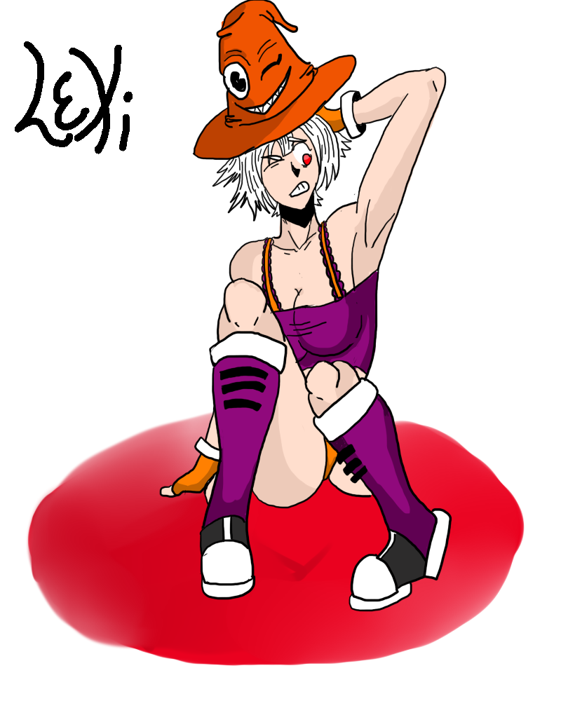
| OOOOOO NICE. Although I would like to say the hat on Lexi looks like the entire thing is on top of her head, as in, her head is not in it. I REALLY LIKE THE FIRST ONE |
|
| | |
Spidey
Spectral
Posts : 952
Join date : 2013-03-31
| | Subject: Re: Along Came a Spider : 12/12/15 Undertale Comic Tue Dec 24, 2013 8:32 pm | |
| |
|
| | |
Baron Von Aardvark
Paranaturalist
Posts : 1005
Join date : 2013-03-29
| | Subject: Re: Along Came a Spider : 12/12/15 Undertale Comic Wed Dec 25, 2013 1:01 pm | |
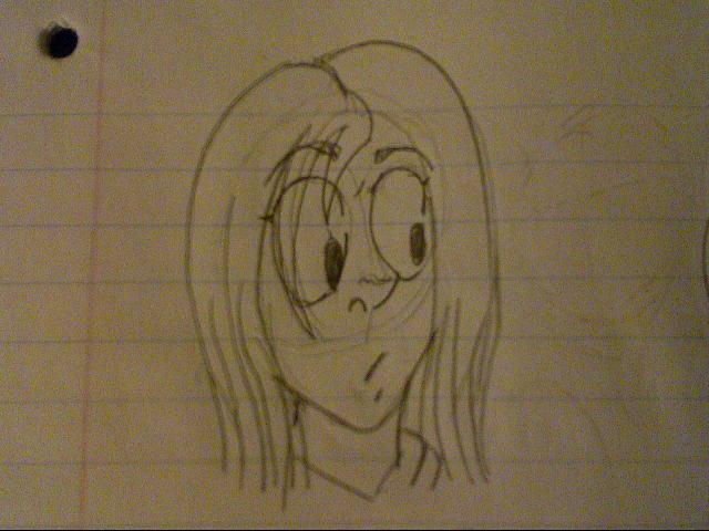
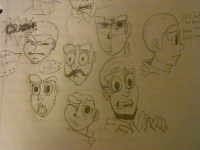
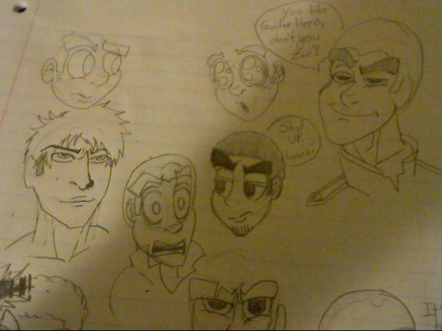
| Those are some pretty nice faces you've got there! Very expressive, and the cartoon-ish style seems to suit you. |
|
| | |
Spidey
Spectral
Posts : 952
Join date : 2013-03-31
| | Subject: Re: Along Came a Spider : 12/12/15 Undertale Comic Sun Jan 12, 2014 2:27 am | |
|  JINX ~ |
|
| | |
Spidey
Spectral
Posts : 952
Join date : 2013-03-31
| | Subject: Re: Along Came a Spider : 12/12/15 Undertale Comic Sun Oct 18, 2015 12:30 am | |
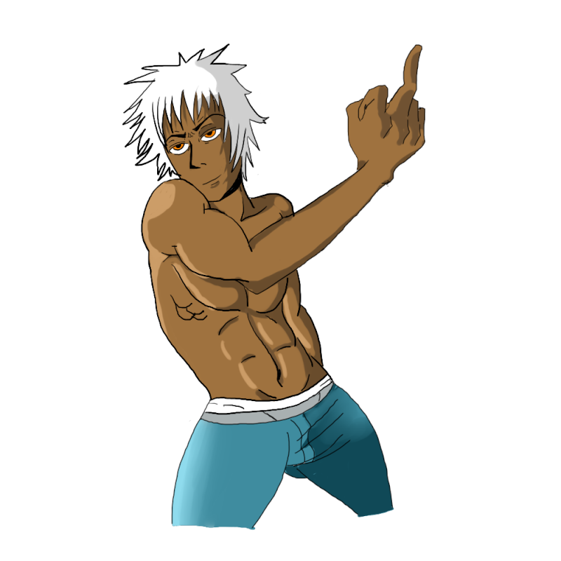
| Holy crap! Have I really posted nothing of substance in almost 2 YEARS?! jesus, time to fix that Valentines Present for my girlfriend  Friend had me draw their oc  Old OC named Reptile  |
|
| | |
Soroya123
Paranaturalist
Posts : 1302
Join date : 2013-03-29
| | Subject: Re: Along Came a Spider : 12/12/15 Undertale Comic Sun Oct 18, 2015 5:27 pm | |
| Heyo! In 2 years your art has improved a lot! |
|
| | |
Westbrook
Spectral

Posts : 533
Join date : 2015-02-17
| | Subject: Re: Along Came a Spider : 12/12/15 Undertale Comic Tue Oct 20, 2015 10:57 pm | |
| I didn't know you had an art topic! This is very neat, I love seeing your improvement.  It's too bad your comic images are broken; I wanted to see those as well... |
|
| | |
Spidey
Spectral
Posts : 952
Join date : 2013-03-31
| | Subject: Re: Along Came a Spider : 12/12/15 Undertale Comic Tue Dec 08, 2015 4:19 pm | |
| Thanks for the comments guys! means alot!   Someone commissioned me to make them a tattoo out of a basic idea, I dunno I think its cool people think my art is good enough to be permanently carved into their body in ink |
|
| | |
NinjaKitten
Paranaturalist

Posts : 1006
Join date : 2015-10-22
| | Subject: Re: Along Came a Spider : 12/12/15 Undertale Comic Wed Dec 09, 2015 3:07 am | |
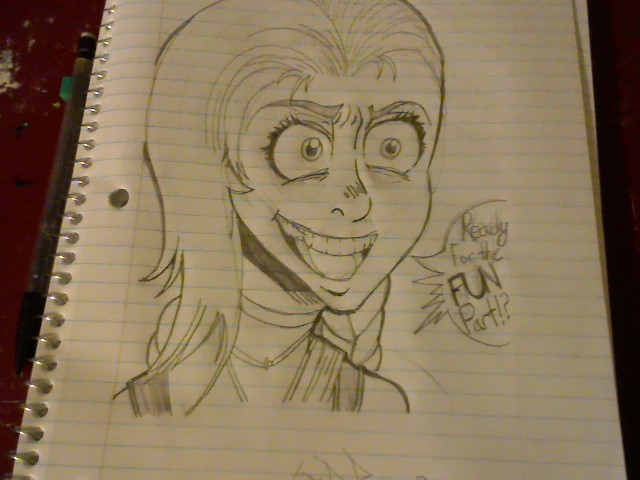
| Those skulls are a great representation of your appreciation for our comments, I'm sure. But! It is really cool that people would want your art on them forever. That's a pretty grand achievement! Congrats! I doubt my art will be that good, 'specially since I spend less time drawing and more time surfing the interwebs and reading books.
Those skulls are really cool, by the way. Great job! |
|
| | |
Spidey
Spectral
Posts : 952
Join date : 2013-03-31
| | Subject: Re: Along Came a Spider : 12/12/15 Undertale Comic Wed Dec 09, 2015 5:34 pm | |
| I actually even snuck a little reference in there if you can find it |
|
| | |
NinjaKitten
Paranaturalist
Posts : 1006
Join date : 2015-10-22
| | Subject: Re: Along Came a Spider : 12/12/15 Undertale Comic Wed Dec 09, 2015 9:50 pm | |
| But a reference to what? The metal-ish skull looks sorta squareish and reminds me of Sans, but other than that, the only thing I'd think to look for is a logo on the tattooed skull. |
|
| | |
Spidey
Spectral
Posts : 952
Join date : 2013-03-31
| | Subject: Re: Along Came a Spider : 12/12/15 Undertale Comic Sat Dec 12, 2015 4:08 am | |
| |
|
| | |
NinjaKitten
Paranaturalist
Posts : 1006
Join date : 2015-10-22
| | Subject: Re: Along Came a Spider : 12/12/15 Undertale Comic Sat Dec 12, 2015 1:03 pm | |
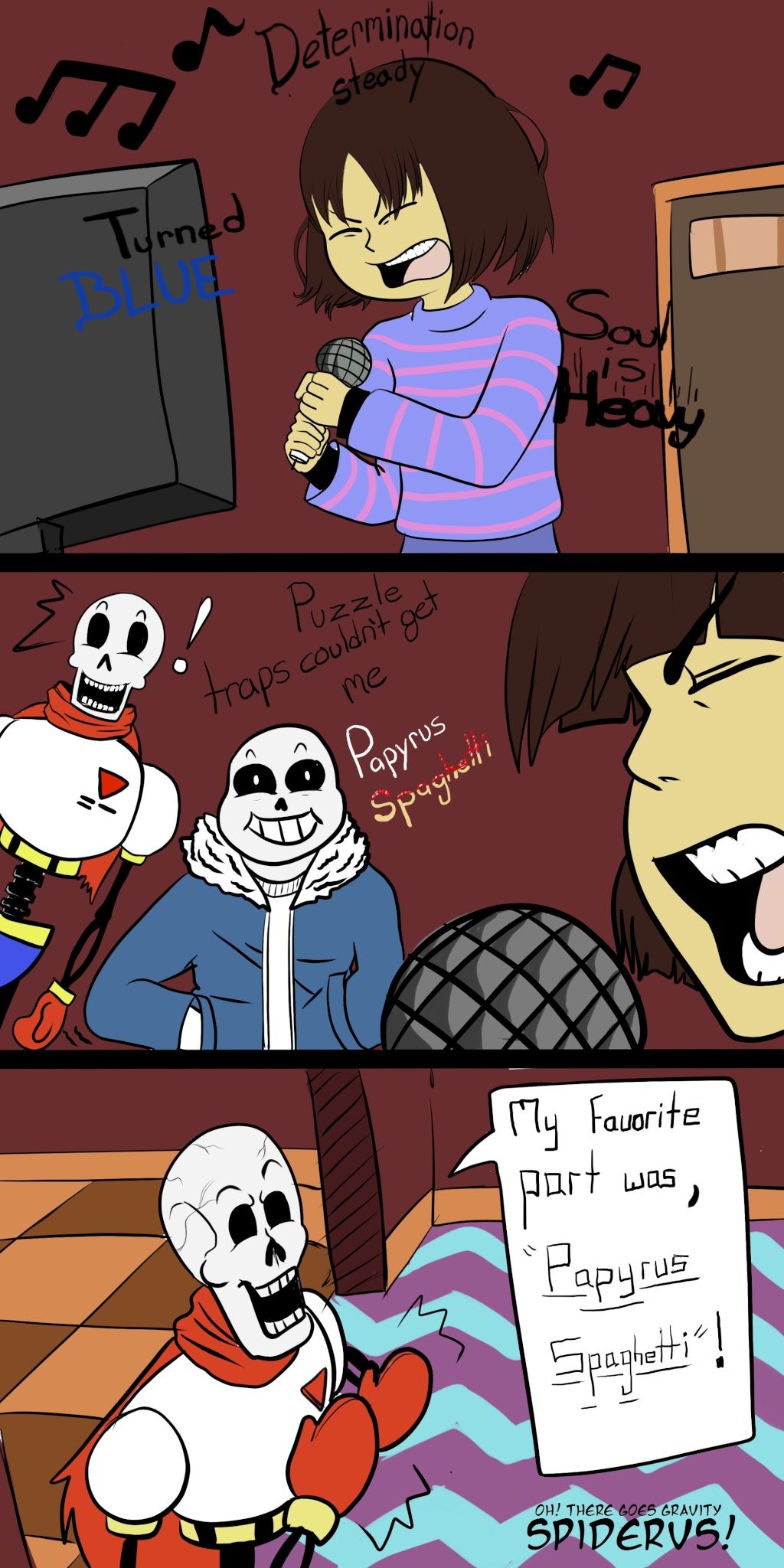
| Oh papyrus. Nice work again! Did you come up with that song? |
|
| | |
Spidey
Spectral
Posts : 952
Join date : 2013-03-31
| | Subject: Re: Along Came a Spider : 12/12/15 Undertale Comic Sat Dec 12, 2015 1:21 pm | |
| nope, its just an extended joke about the "mom's spagghetti" lyric in one of eminems songs |
|
| | |
NinjaKitten
Paranaturalist
Posts : 1006
Join date : 2015-10-22
| | Subject: Re: Along Came a Spider : 12/12/15 Undertale Comic Sat Dec 12, 2015 1:24 pm | |
| Ah, I see. I don't listen to Eminem, so I wouldn't know much about that. |
|
| | |
Sponsored content
| | Subject: Re: Along Came a Spider : 12/12/15 Undertale Comic | |
| |
|
| | |
| | Along Came a Spider : 12/12/15 Undertale Comic | |
|